AI Assisted Intake Form
At Intapp, I led the design of an AI-assisted intake form for Intake, our internal business intake product used across professional services firms. The idea was straightforward: instead of asking professionals to re-enter information they'd already written in an email, let the system read the email and fill in the form for them.
Web Design
Context
The original brief was simple: let AI fill out the form. But the more I talked to users, the more I realized that automation alone wasn't the answer.
Enterprise users weren't just dealing with repetitive data entry. They were dealing with the anxiety that comes with it. Who extracted this information? Is it correct? What did the AI change and what was already there? In professional and legal services, where a matter record is a compliance artifact as much as a workflow tool, those questions aren't optional. Users needed to understand what the AI had done, feel confident in the data it surfaced, be able to correct it easily, and know that the final decision was always theirs.
The real design challenge wasn't building an AI that could fill in fields. It was building an experience where people trusted it enough to actually use it.

Explorations
The question I kept returning to was how visible the AI should be. Should users feel like the form had been filled in for them, or they were doing the filling with a lot of help?
I explored two directions: AI suggestions inline beside each pre-filled field, and a summary panel at the top showing everything the AI had populated before users touched the form.
Testing was clear. People skimmed the summary and still questioned what had changed. The panel added a step without adding confidence. The inline approach did the opposite. When suggestions appeared right where users expected to type, they felt in control even though the system had done most of the work. That sense of control made them far more willing to trust what they were seeing.

Final Solution
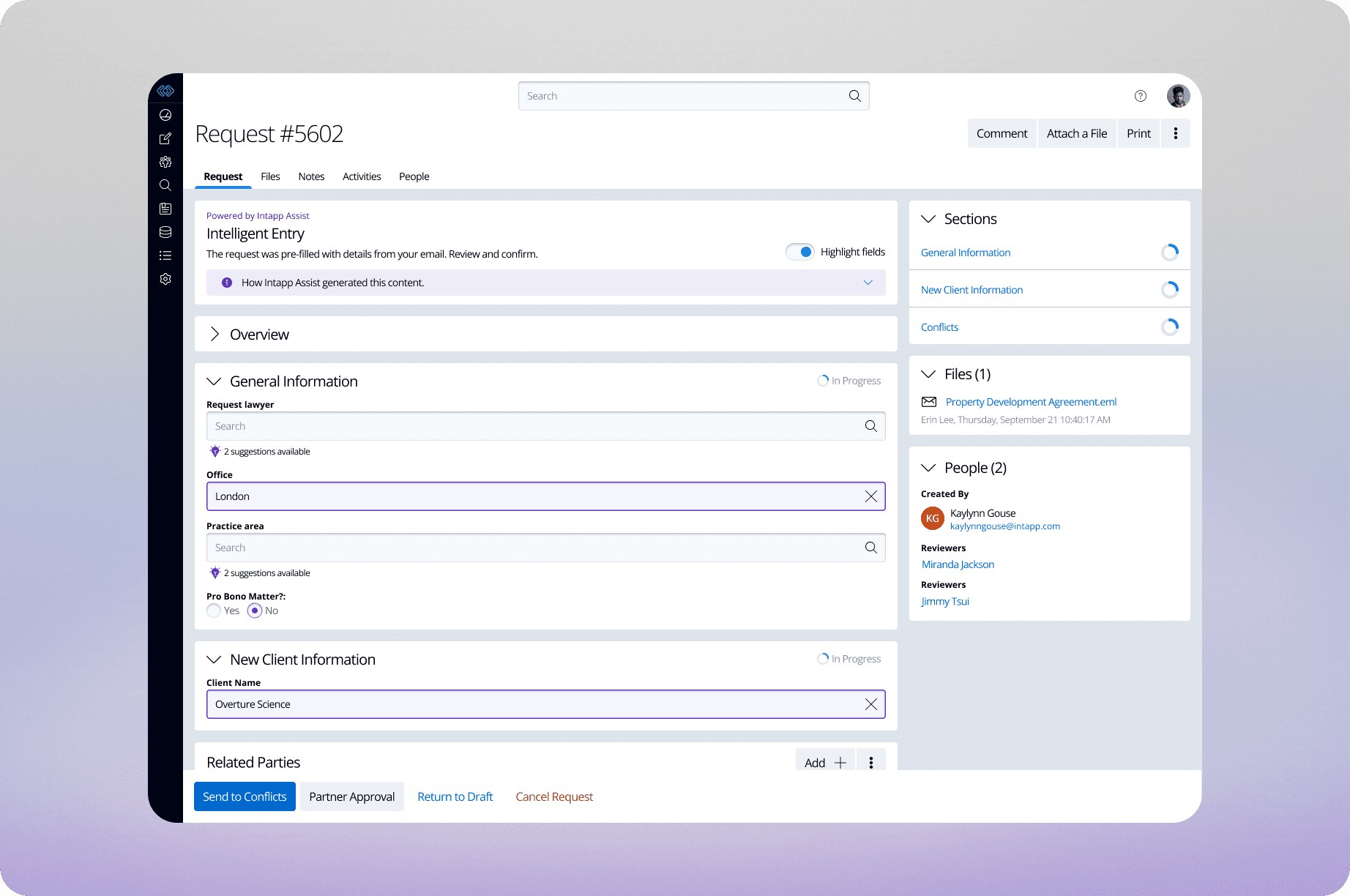
The final design lets users drag an email directly into the form. The system reads it, extracts what's relevant, and pre-populates the fields. Same workflow, just faster.
A highlight toggle lets users scan all AI-populated fields at once. Every suggestion is editable in place, and when the system finds more than one plausible value, it surfaces the options rather than guessing. In an environment where accuracy is non-negotiable, that reviewability wasn't a feature. It was a requirement.
The principle I kept coming back to: AI-assisted should never mean AI-controlled. The system does the first draft. The person does the thinking. When that balance is right, the form doesn't feel automated. It just feels easier.


